Your Cart is Empty
Free shipping on homeware orders over $129, use code 'AUFREESHIP'
No, it's not how to dress for winter, although the theory is pretty much the same. A well decorated home also has layers but it's an all year affair.When I decorate a house or give advice to my clients, I stress the need to create layers of various textures, patterns and colours. Having too much is busy and too little seems one dimensional and flat.
Here is a crash course to the art of layering and making your home well dressed.
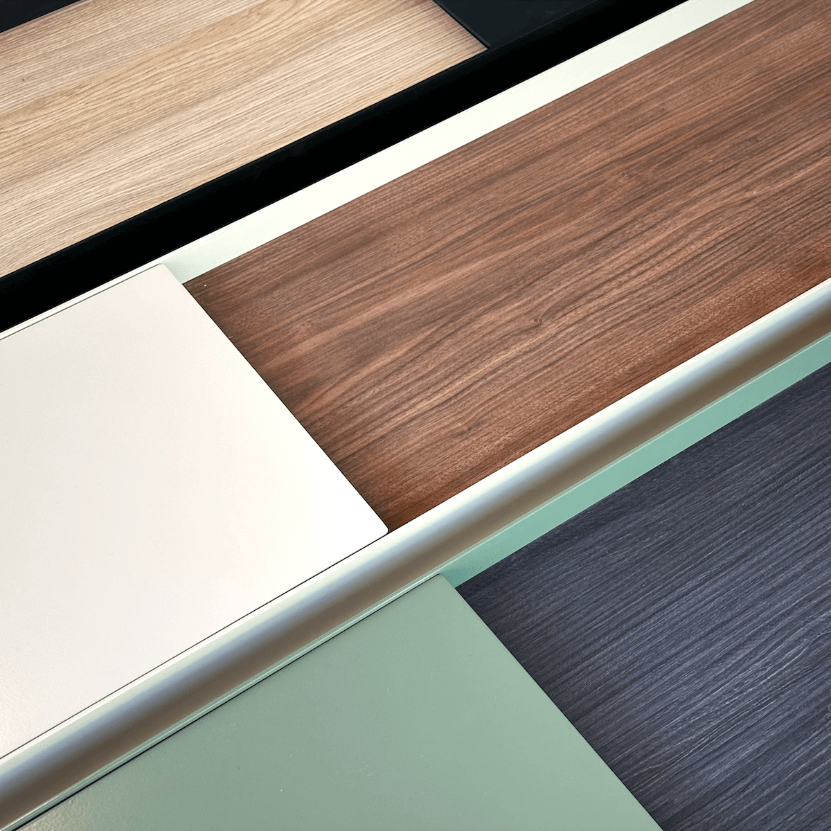
Textures
Imagine wearing a wool sweater with a wool coat and a wool scarf. Doesn't look very interesting does it? It's the same thing when decorating your home. Incorporating a combination of materials such as metal, glass, upholstery and timber appeals to the visual and touch senses. Having timber in most of your furniture just looks monotonous and one dimensional. Your interior design style will dictate which proportion of textures to use. A sleek modern scheme will use more glass and metal whereas a Scandinavian scheme will use more wood.
Texture can also relate to using one material in different finishes. For example, timber - rough sawn, polished, antiqued or matt finish are just some considerations to look at. This type of texture is easier to put together because they usually complement each other.
Patterns
I have a rule on contrasts. A solid works fabulously with a pattern. A solid can go with another solid but be careful combining a pattern with another pattern. You can contrast things that are adjacent to each other. For example, a patterned cushion or throw will look great on a solid coloured sofa. A patterned rug will look great underneath a solid coloured sofa.
Another factor to consider is the size of patterns. If you are combining patterns together, the rule of contrasts applies. Put together a big pattern with a small pattern. One solution to bypass this predicament is to go with tone on tone pattern. This way, the texture will give you the depth without busyness.
Colour
Colour is a tricky one because it's all about personal preference. I recommend using a combination of a neutral base and bold colours. In general, use three to five bold colours in total. For example, a neutral base like charcoal or white lends itself well to most colours and if it is used in some form or another in each room, it will provide a visual continuity throughout the house.
I hope the advice above is helpful in your adventure in decorating. Consider how you would coordinate your outfits and apply it to your home. If you are challenged in this area, then this article might make you dress better!
Happy decorating!